The Art of Print is an Edinburgh based Fine Art Giclée Printing & Reproduction Studio. I spoke with artist and owner Kevin Leary on his studio practice and what artists should know about printing…
When Kevin reproduced one of my paintings the care and precision he brought to the lighting, camera set up, colour tweaking, paper choice and test prints resulted in a giclée print so vivid and accurate it could pass for the original. And it’s not just me, these artists and illustrators are just as impressed.
Kevin’s a long time friend so I’m delighted to bring his work to a wider audience and a generous discount for MoMa readers at the end!
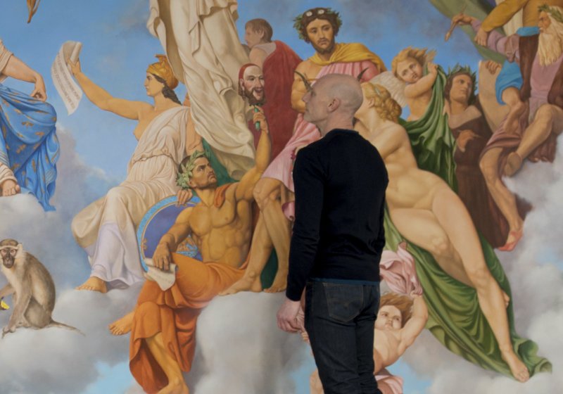
Kevin Leary in front of a section of his painting ‘After Matout, Meynier and Leary”, oil on Canvas – 8.75m x 3.65m.
I’ve been working as an artist for over 25 years since studying Drawing and Painting at DJCAD in the nineties. My first studio was in the Stirling Tolbooth where I started doing portraits and large scale, slightly surreal, figurative oil paintings for local businesses. When an advertising company approached me to paint footballer Richard Gough for his testimonial year it led to a long line of sporting portraits which I continue to do, Mohamed Salah and Gerard Pique being recent commissions.

Portrait of Liverpool FC player Mohamed Salah by Kevin Leary.
In 2001 I opened artist’s studio spaces in Edinburgh and also started work as a scenic artist at the Royal Lyceum Theatre where I built and painted sets for 13 years. It was exciting to construct, paint and install different large scale set designs every month for thousands of viewers.
I went part time for the latter half of my stay to continue my art and this led to some large scale commissions. Most notably painting the Kings Theatre Dome for Scottish artist and playwright John Byrne.
The King’s Theatre project led to another large painted dome commission, then a classical figurative work for a nine metre curved wall project in Glasgow. Other various projects include some film set construction and audio visual displays for business.
The Art of Print takes up a good part of my week now and I’ve been working on geometric abstract drawings and digital colour compositions which are taking my work in interesting new directions.
There was no revelation to start an art reproduction studio, it’s been much more incremental.
I initially made some limited edition prints of my landscape paintings and used an old offset lithographic process where the inks were printed from separate metal plates. The prints were successful but tricky to do well and editions needed to be large to cover costs. The process was cumbersome and the storage of thousands of prints was problematic.
When I started working for the theatre I had access to a large format printer they used for printing CAD drawings. As my Photoshop skills improved I began using the printer for set covering, backdrops and wallpapers. It was amazing how much time it saved compared to painting by hand and how convincing (even low resolution) printing looked on stage from the auditorium.

Educating Agnes set design – Royal Lyceum Theatre. Photograph by Kevin Leary.
I documented the sets with photography for several years leading to an exhibition at the Lyceum Theatre in Edinburgh. Around this time I acquired a broken large format giclée printer from a gallery in Glasgow. After much googling, dismantling (and applying home made solutions through syringes!) I had my first pigment printer. I used it to produce the exhibition prints and started printing more of my own work and for friends and colleagues.
Many years of progress later and I’ve gained the skills, knowledge and experience to produce beautiful prints using the very latest in print and reproduction technology.
I aim to be proud of all the printing we do, whether a single personal photo, an art print edition or bespoke wallcovering. All are treated with the same care and consideration. The larger projects tend to be the most memorable though.
Some of the theatre sets were particularly satisfying where almost entire sets were printed with huge wallpapered scenes.

Beauty & The Beast Set Design – Royal Lyceum Theatre. Photograph by Kevin Leary.
I also printed an actual size (10 metre diameter) mock-up of the Kings theatre dome design from an 80cm painting. It was a great resource for painting the actual dome and for John Byrne to guide me.
Reproducing a Francis Cadell painting for a family in Italy was particularly rewarding. They were selling the original work for their children’s inheritance and wanted a copy for each child and grandchild. I also enjoyed reproducing a Victoria Crowe painting so it could replace the original while in an exhibition at the Portrait gallery in Edinburgh and on tour.
I’ve reproduced many older paintings for clients looking to sell their original and still retain a copy. These are tricky, as the paintings are often dark and dirty with thick layers of shiny and dull varnish that clients sometimes want recreated!
I get a lot of satisfaction in creating a digital image and print for an artist or client who is delighted with the results.

Visit our new website for more information on everything we do.
If any MoMa readers are thinking of printing their work, please get in touch. Our website has a lot of information and will give an overview of pricing and services and we are happy to offer any further advice or help via email, phone or in person.
We start by creating a digital file of the artwork through photography or scanning. A high resolution, evenly lit digital image is the foundation for a good print. Some post production work will likely be required to tweak colours and tonal values and some proof prints are made at this stage to ensure accuracy.
If an artist already has a digital file of their artwork, a printed proof is still advised to ensure what they see on their monitor will print accurately. Even our Eizo Colouredge monitors don’t show some of the nuances of different papers so a print to compare with the original work is best.
Once the artist is happy with the printed proof then print sizes can be set and it can go to print. This can be a one-off, several copies or a complete edition.

“After Callet, Reni and Leary” by Kevin Leary, oil on domed ceiling, 250 x 2650cm
We use Canon Lucia Pro archival pigment inks and archival papers from Hahnemuhle and Fotospeed, key ingredients usually missing from a home set up which I believe are vital for an artist selling their work. A standard inkjet printer uses dye based ink which can fade within months/years. We use high quality display monitors and colour calibration hardware with the output accuracy of Canon’s Pro series printers using 12 colour ink sets and icc paper profiles.
The rest is about skill, experience and care. My sensibilities as an artist are particularly useful in attaining colour and tone accuracy and discussing aspects with clients. Everything adds up to greatly enhances results.
When it comes to photographing artwork for print a good full-frame sensor camera and lens are recommended.
Take as much care as possible to set the lighting, camera framing and focus. The artwork has to be lit very evenly and relatively strongly. I can’t stress this enough.
We measure light angles and distances and bounce light off reflectors to make sure it’s evenly lit. Small anomalies are exaggerated in print and often unnoticeable when viewing through the camera. Focus and level framing of the image are the next considerations. We use a Sony AR7 iii mirrorless camera with Sigma art lenses because they give great sharpness, colour accuracy and high resolution files. And an X-rite colour passport to help calibrate colours.
The digital image is still going to need some colour and tone work. Every electronic device has a slightly different colour space. Experience of how your devices record and display colour and tone and the ability to manipulate this well with software is vital for an accurate print. Image software gives us the ability to manipulate an image but also the ability to mess things up or lose details, so the closest base file is beneficial.
An accurate, calibrated, high quality monitor is important so any changes you make will be correctly viewed. Camera resolution is also worth noting so you know roughly how large that resolution will allow you to print. Some lower res cameras still produce better, sharper images than much higher res cameras so experience is probably the best answer here. We usually try and print at 300dpi resolution or higher. Imaging software can show image print dimensions at particular resolutions.

King’s Theatre Dome project, Edinburgh. 78.5 sq/m.
The scanner is a little more convenient to work with but has a little less control over textures. I would usually go to the scanner first unless there are heavily textured areas intended to show in the print. Here I would look to light more sensitively and photograph.
We can scan up to A2 currently and are looking at the possibility of larger bed scanners but our photographic studio is very well lit and can handle up to around A0 at present. We can print to 112 cm wide by several metres and larger outputs are made with multiple print lengths joined.
A lot of work is posted to us, especially up to A2 size and I have clients as far as Melbourne and the Bahamas. It is valuable to have the original work present when creating proofs and to photograph the original in a controlled setting/studio, so I do prefer to have or collect and return originals. I can also travel from Edinburgh to photograph work depending on distance, budgets and the work involved.

“57” digital artwork by Kevin Leary.
Monitor calibration is possibly the weakest link in the production of pre supplied files. If a client is sending a digital file, it’s difficult for us to know if they are seeing a well calibrated view of their image on their monitor. Monitors are often overly bright and saturated and this can give unexpected results so a hard proof copy is recommended, especially if the print run is for multiples. Along with this, colour spaces used can be a little tricky – an overview can be found on our site. We are generally talking about colour spaces such as SRGB, Adobe RGB98, Adobe ProPhoto or CMYK and when they should be used. We generally recommend using Adobe RGB98 although SRGB is okay but has a little less colour gamut.
Image resolution can be a little confusing. I am often asked for a print size which is beyond what the supplied file can stretch to resulting in a lack of sharpness and poorer colour and tone transitions. File sizes need to be pretty large to print at A2 size and larger (printing at 300dpi). It’s roughly 7000 x 5000 pixel size for an A2 print. Many high resolution full frame professional cameras are at their limits here. Higher resolution camera backs, expensive ultra high res cameras or joining of images can be deployed beyond this.
I mentioned our use of pigment ink and archival papers for our printing. This sets us apart from commercial higher volume printers who commonly use latex or wax based inks which don’t have the necessary archival qualities and their ink sets vary from 4-6 colours offering a much lower colour range. C-type printing is a chemical based wet process of printing generally used for photography but this also does not have the archival qualities of Giclee printing or the colour ranges available. Our high quality archival inks and papers are Artsure approved and depending on environment should last 100+years and are capable of printing many more colours.

I like a medium weight paper with a slight texture and a slightly warm white tone, a bit like a soft traditional watercolour paper. It always seems to impress people and just feels nice in the hand. Our “Smooth Fine Art 300gsm” is like this. Our website showcases most of our papers with details on their colour and texture.
I also love our “Platinum Etching” paper, the texture is lovely and it always prints beautifully. We’ve explored many different papers and our current stock was chosen for their excellent archival properties with slightly varying textures and white tones. A good image should look great on any of them.
There are some nuances which may enhance things a little. I have a client who regularly paints snow and a slightly brighter white paper brings out its qualities. Heavier saturated illustrations or oil paintings can benefit from a sharper paper which holds a little more ink. With regards to texture, it’s more personal and can depend on whether there is much paper white showing or what the detail of the image benefits from.
Paper choice is probably the least problematic part of production. The digital file creation and colour work is much more critical to the quality of the print.
As an extension of their work, our printing is intended to add to an artist’s reputation, so it is nice to play a part in a successful print run. Knowing we have helped produce a good product in demand is highly rewarding.
Artists of note who return consistently for more prints and for new prints are wildlife artist Chris Rose whose paintings are quite realistic yet have an underlying abstraction and pattern I really appreciate.

£160
Buy OnlineChris Rose – Winter Fox
Giclée print edition of 125, Paper size: 61 x 63cm, Image size: 44.5 x 49cm.
Illustrator Jenny Proudfoot has a lovely quality of line and draughtsmanship and sells extremely well online and in shops.

£35
Buy OnlineJenny Proudfoot – Scotland Map
Signed giclee print on lightly textured, 300gsm, fine art cotton paper. A3 or A2 sizes.
Lily Macrae is a young artist working in Glasgow whose paintings I love and whose sales appear to be rising.

Lily Macrae – Decadence And Debauchery
(After Couture’s Remains De La Decadence) Oil on canvas.. 200 x 150cm.
I care about all the artworks and artists that pass through our studio. I enjoy working with clients and doing the best I can for them means a lot to me.
For further information, friendly advice or a detailed look at our services please visit our new website theartofprint.co.uk.
Having launched our new website just as the nationwide lockdown commenced we’ve been unable to meet clients and visit galleries and studios to promote our services and new branding. We look forward to connecting with artists again and hope the creative spirit is even stronger after this difficult time.
To help support fellow artists we would like to offer an introductory discount of 20% to new customers from MoMa (just mention MoMa when you order – minimum order £20 for discount).

Thanks again to Kevin for being so generous with his time (and discount!)


